Critique: Wizard of Oz Illustration
I like where my illustration for (Un)Covered is heading, but I still think it needs some work. The purple needs to be lightened up, and I want to make the trees look less cluttered. I think I might also add the Emerald City to the end of the brick road, and make the edges of the brick road softer. I’m also playing with the idea of making the cover simpler and focused on the characters. I like how they turned out, I’m just not satisfied with the rest.
You Can’t Miss: The Graphic World of Paul Peter Piech
Eye Magazine recently featured the graphic artist Paul Peter Piech. After just completing the (UN)Covered illustration, I found his work very inspriational. It shows how illustration does not have to extremely detailed to be make an impact. I love the stamped look of his work and especially appreciate his ability to so seamlessly combine illustration and text. Definitely someone to consider for inspiration when thinking about the fiction issue.
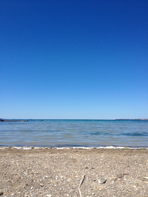
Photo Inspiration: Take me back to Croatia.
In honor of Spring Break and it being Throw Back Thursday, I am featuring this photo I took last spring while on the beach in Croatia. I find the emptiness very inspiring. I often get caught up in adding things to make designs look “pretty” when sometimes all you need is the bare bones. It is something I plan to work on in the future.


I really like your (UN)cover. I feel like you have kind of a happy color palette that I usually find quite refreshing, but these colors seem quite a bit darker and I like that side too. And I love the Paul Peter Piech illustrations. I love peeking in at all illustrations because I have a lot of room to grow.
Your cover design is such a different perspective on Wizard of Oz. I love the point of view seeing the characters on their journey. I agree that the background needs some simplification, but it looks like you’re headed in the right direction. Your Paul Peter Piech and Croatia inspirations might help with this, since both use negative space outstandingly.
I feel like I also struggle with adding too much to a page. This is a balance that I’m trying to work on as I make style decisions about Vintage Now. I think both the stamp illustrations and your photo inspire me to appreciate simplicity and negative space more.